The Miniature Painter's Colour Wheel: How to Build a Palette That Actually Works
In the shadowed halls of the grimdark, the difference between a scheme that sings and one that dies on the shelf comes down to a single decision: which bottle to open first. This is the field guide that turns the wheel from an art-school poster into a working tool at your bench.
Why most colour wheel guides don't help you paint
You have read a dozen articles on colour theory for miniature painting. They all say the same things. Red, yellow and blue are your primaries. Mix them for secondaries. Complementary colours sit opposite. Analogous for harmony. Great.
And yet, when you sit down at the bench with a Space Marine primed and a hundred paint pots staring at you, none of that theory tells you which bottle to open first.
That is the problem. Colour theory taught by artists was designed for painters mixing from three tubes of pigment. Miniature painting works differently. You have hundreds of pre-mixed acrylics on your desk, and the real skill is not mixing new colours from primaries — it is choosing a coherent palette from what already exists, and knowing exactly how each colour relates to every other colour in your box.
That is what a proper miniature painter's colour wheel is for. This guide shows you how to build one, use it, and design schemes that hold together on the tabletop.
What a colour wheel actually is
A colour wheel is a circle that puts every hue in order around it. Reds bleed into oranges, oranges into yellows, yellows into greens, greens into blues, blues into purples, and purples back into reds. That is the whole idea. The wheel just organises what your eye already knows: some colours sit next to each other in the rainbow, and some sit opposite.
Everything useful about colour theory — complementary, analogous, triadic, split-complementary — is just directions on this circle. Once the wheel is real for you, the schemes are obvious. Until it is, the theory sounds like homework.
The three colour relationships that matter for miniatures
For miniature painting specifically, you only really need three relationships. Everything else is a variation.
Analogous — colours next to each other on the wheel
Reds and oranges. Blues and turquoises. Yellows and yellow-greens. These schemes look natural and cohesive because that is how colours actually appear in the world. Rust, foliage, flesh, cloth in shadow — all analogous. Use analogous colours for anything that needs to feel unified: a single-faction army, an environment-heavy diorama, a character whose story is about restraint.
Complementary — colours directly opposite
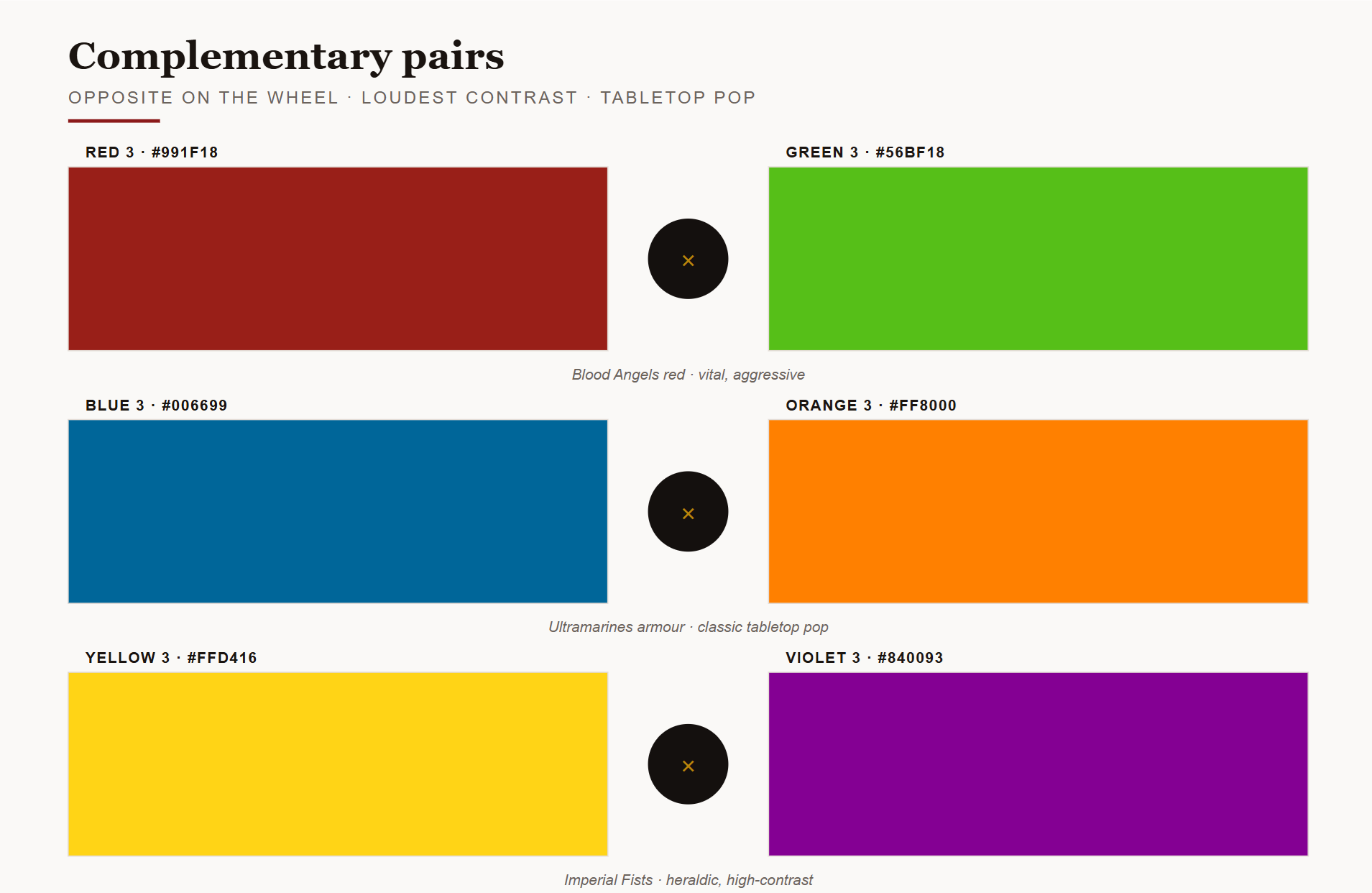
Red versus green. Blue versus orange. Yellow versus purple. This is the loudest relationship on the wheel and the one that makes miniatures pop on the tabletop. Blood Angels lean hard into red-versus-orange-yellow. Ultramarines pair blue armour with gold accents (blue's complement is orange, and gold is a warm orange). Complementary schemes are what make a miniature you can spot across a gaming table.
Triadic — three colours evenly spaced around the wheel
Red, yellow, blue. Orange, green, purple. Triads are the "characterful" scheme — they feel deliberate, stylised, almost heraldic. Use them when you want an army to feel like a design, not a naturalistic depiction. Most Warhammer chapter schemes are secretly triads.
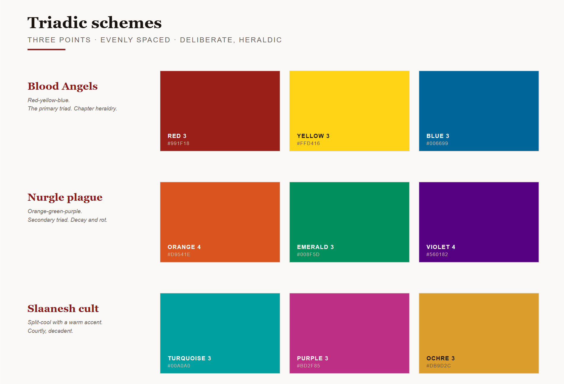
There are more schemes — split-complementary, tetradic, square — but if you internalise these three, ninety percent of your palette decisions become instinctive.
The problem with the classic wheel: six colours are not enough
Here is where things get practical. The colour wheel you learned in school has six colours. Twelve if you count tertiaries. And that is fine as theory. But when you are choosing between three shades of red on your desk, six-colour theory does not help you decide which one to grab.
A working miniature painter's palette needs more resolution than that. Reds are not one thing — a coral red, a blood red, a cool crimson and a warm scarlet are four different directions on the wheel, and picking the wrong one against your armour blue will kill the scheme before you have even started highlighting.
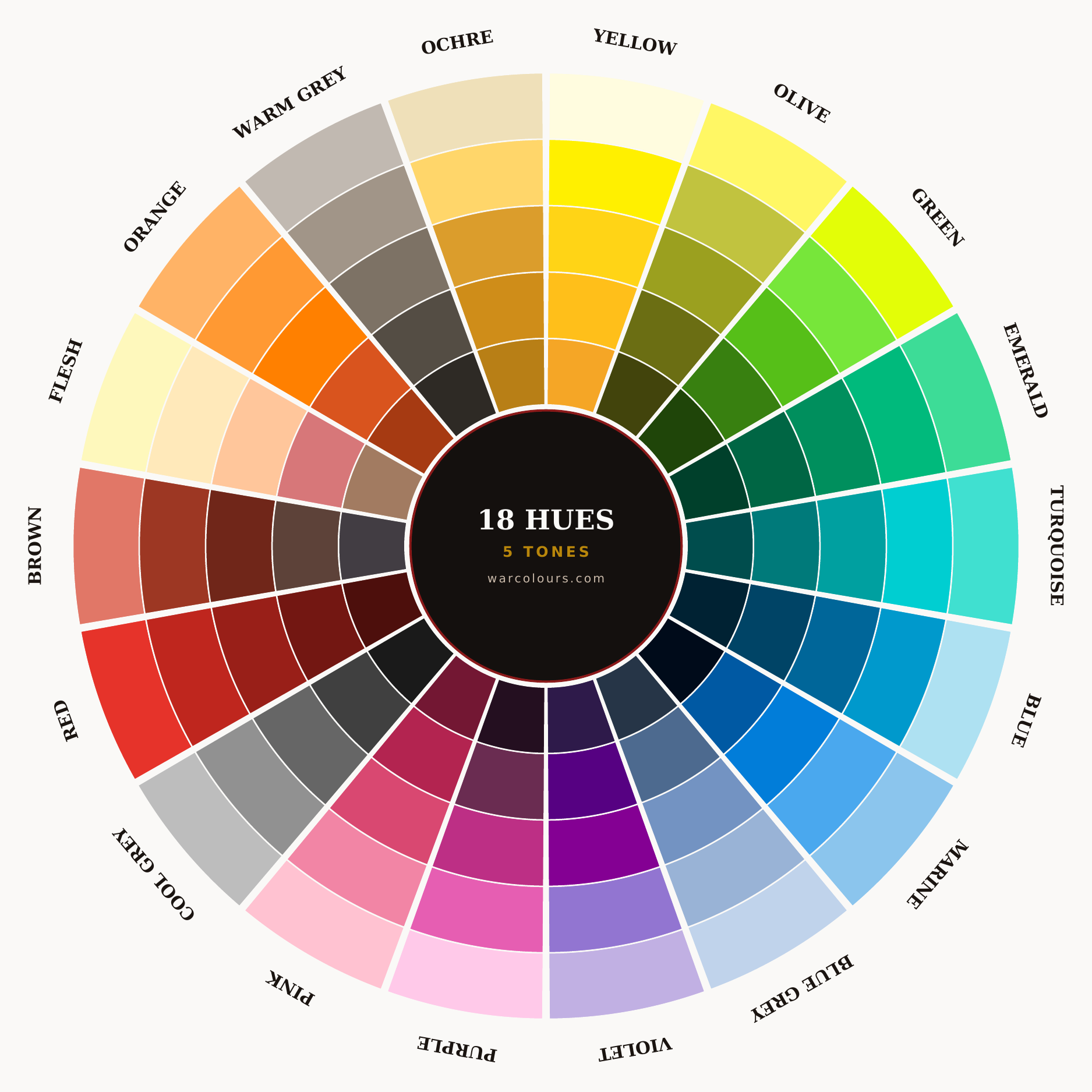
This is the reason we built the warcolours palette around eighteen hues instead of six. Each hue sits at a mathematically calculated position around the wheel, so the relationships stay predictable no matter how deep into the palette you go. Complementary is exactly opposite. Analogous is exactly adjacent. A triad is exactly a third of the way around. There is no guesswork about whether this red pairs with that green — the geometry of the wheel guarantees it.
You do not need our paints to use this idea. What matters is that you build a mental wheel with enough resolution to make real decisions. If you already own a wide range from Citadel, Vallejo, Army Painter or anyone else, print a wheel, arrange your paints around it by hue, and you will start seeing schemes you did not know were sitting in your paint drawer.
Get the printable colour wheel
The full 18-hue wheel, laid out for the bench. A4, print-ready, warcolours-branded. Pin it above your desk and stop guessing.
Free download — get it nowHow to build your working palette from scratch
If you are starting fresh, or building a palette for a new project, work in this order.
- Pick your two anchors.Every scheme needs a dominant colour (the largest area of your model — usually armour or cloak) and a secondary colour (the second-largest area — usually weapons, cloth, or shield). Choose these two using one of the three relationships above: analogous for cohesion, complementary for contrast, triadic for character.
- Pick a tone for each anchor.Every hue has a range from dark to light. Your dominant colour usually wants a mid-to-dark tone so highlights have somewhere to travel. Your secondary can sit anywhere, but it feels most balanced slightly lighter than the dominant — that draws the eye to the details without stealing focus.
- Add an accent.The smallest area — jewellery, glowing effects, a plume, an eye. Use the strongest contrast you have not used yet. If your anchors are analogous, your accent should be a genuine complementary (loud, opposite). If your anchors are already complementary, your accent should be a triadic third point (structured, deliberate). This is the colour that finishes the sentence.
- Pick your neutrals last.Leather, metal, bone, stone, base — these are supporting cast, not lead roles. Warm neutrals (browns, ochres, warm greys) support warm-dominant schemes. Cool neutrals (blue-greys, cool stone) support cool-dominant schemes. Get this backwards and the whole miniature feels off even though the colour theory is technically correct.
Four decisions. Two anchors, one accent, one neutral. Every scheme you have ever admired follows this structure, whether the painter thought about it consciously or not.
Warm and cool: the hidden lever
The single most useful concept nobody teaches beginners is warmth. Every colour on the wheel is either warm (reds, oranges, yellows, warm greens, warm purples) or cool (blues, cool greens, cool purples, cool greys). And crucially — any single colour can be pushed warm or cool.
A cool red pushed toward magenta feels sharp, poisonous, alien. The same red pushed toward orange feels vital, alive, aggressive. Same "red" — completely different miniature.
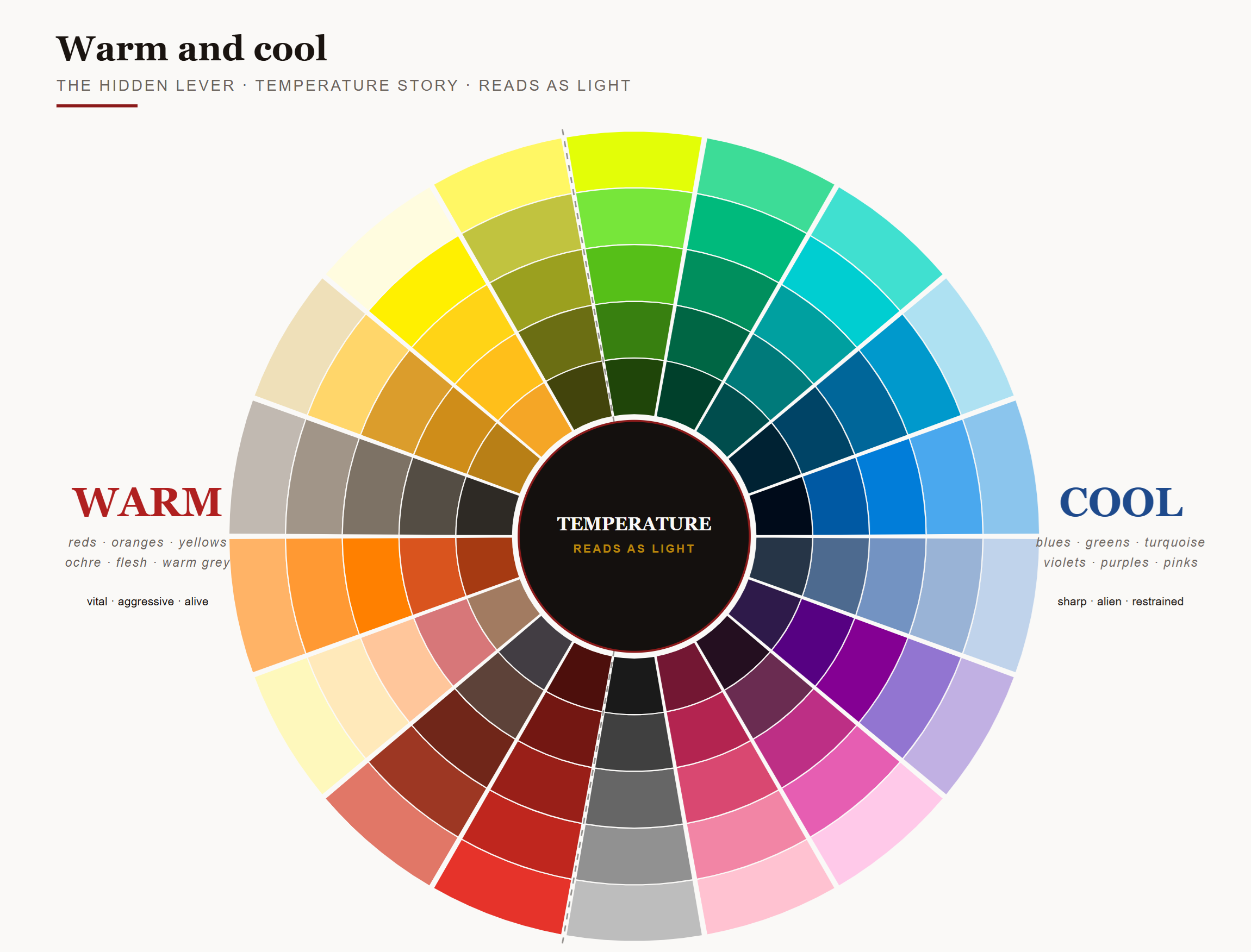
This is the lever that separates a technically-correct paint job from an evocative one. Once you can identify the temperature of every paint in your box, you can:
Build temperature contrast into your highlights. Highlight cool colours with a warmer version, and vice versa — the eye reads the temperature shift as light hitting the model.
Set an entire army's mood. Bias your whole palette warm for aggression and life, cool for restraint and dread.
Create genuine focal points. Put a lone warm accent on a cool-dominated model — a glowing weapon, a red eye, a burning brazier — and the eye locks onto it.
Look at any painter whose work you envy. There is almost certainly a temperature story running through the whole model that they may not even be able to articulate. That is the wheel doing invisible work.
Applying this to your existing paint collection
You probably already own more paints than you realise. Before buying anything new, do this.
- Empty your paint drawer onto the desk.All of it. Every bottle, every half-empty pot, every emergency purchase you have not opened yet.
- Print a blank colour wheel.Any twelve or eighteen-segment template will do. The printable warcolours wheel above works perfectly.
- Sort each bottle into the segment that matches its hue.Ignore tone for now — sort by where on the wheel, not by how dark.
- Within each segment, arrange from darkest to lightest.You have just built your working palette. Every scheme discussion in this guide now maps directly onto what you own.
Two things will surprise you. First, you probably have more colours in some segments than others — most painters have a "favourite quadrant" of the wheel and buy into it repeatedly. Second, you almost certainly have gaps — hues that are not represented at all, which is why some schemes you have wanted to paint have not worked. That is your shopping list. Not a whole new range — just the specific hues missing from your wheel.
Where warcolours fits
We built the warcolours Layer range around a full 18-hue wheel with 5 tones per hue, plus black and white, because that is the resolution a working miniature painter's palette actually needs. Every relationship in this guide — analogous, complementary, triadic, temperature — is physically visible the moment you look at the wall of colour on the rack. You are not translating theory into product. You are looking at the theory made real.
The palette is designed to be entered anywhere. You do not need to start with all 92 colours. Pick the hue you paint most often, buy a full tone ladder in that hue, and add adjacent hues as your projects call for them. Because every hue sits in a predictable position on the wheel, whatever you add next will already work with what you have.
The whole wheel, in bottle form.
92 Layer paints. 18 hues. 5 tones each. Plus black and white.
Explore the warcolours Layer range →
That is what a proper miniature painter's colour wheel is for. It should not sit in an art book. It should sit on your bench, in bottle form, and make every scheme decision faster and better than the last one.
Written by the warcolours forge in Nicosia, Cyprus. From our hands to your brush.